 Contact Us


This is a description of how sliders work in Pixera Control UI. This is split into 2 parts, one how to use it for control actions and one how to use it for Pixera elements like timeline opacity
Use Sliders with Pixera Control actions
For control actions, it is best to use an action with attribute double, so that the values are also saved when the Pixera project is saved.
I have selected "Lock Linked Action to Action" to automatically place the linked action on the same action. In earlier versions, this button does not yet exist and must therefore be entered manually. The linked action ensures that the fader is not reset when, for example, a UI page change occurs. The linked action retrieves the value.
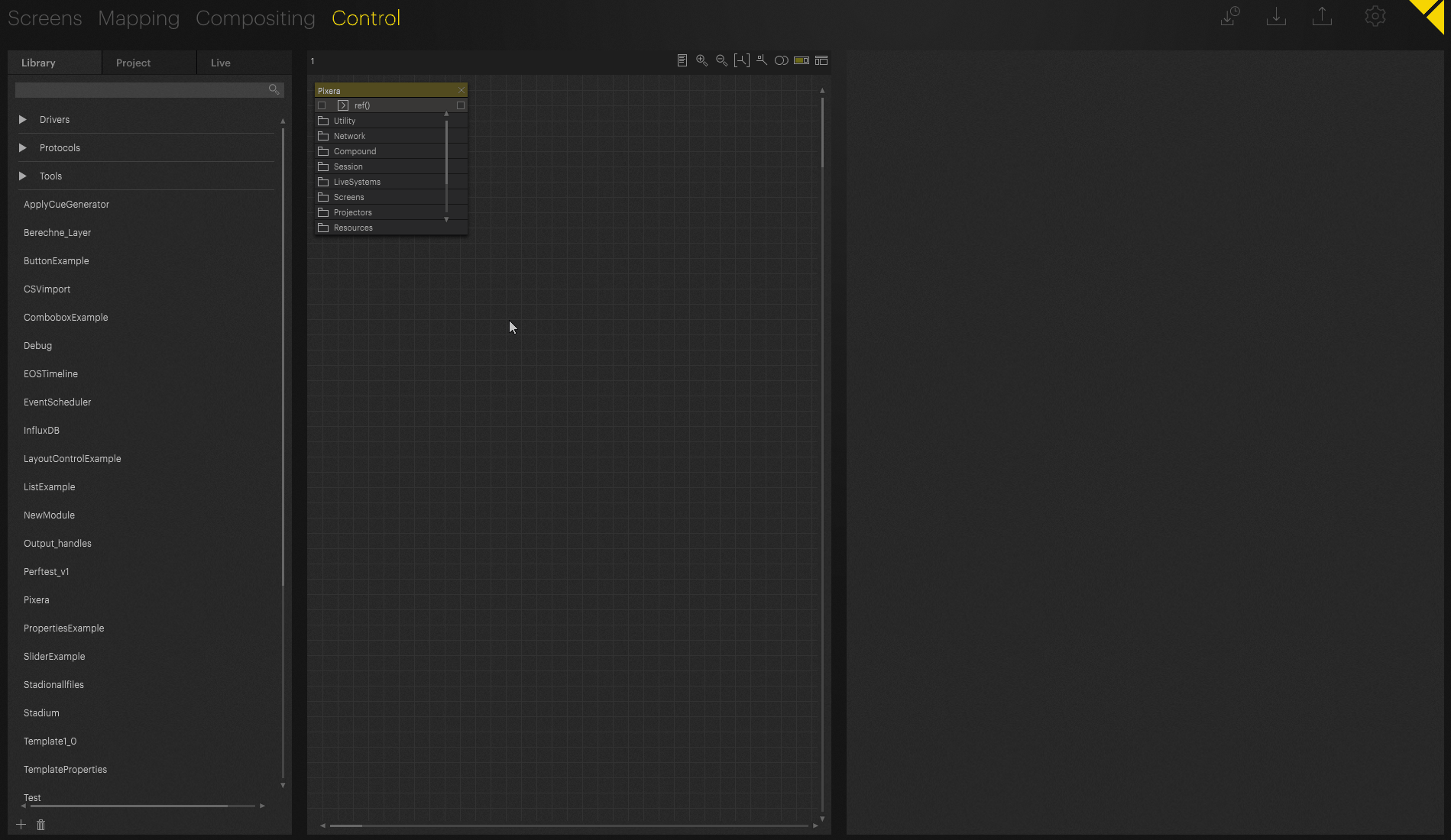
Use Sliders with Pixera API Elements
In this case, we need to set the action to setOpacity and the linked action to getOpacity to retrieve the value of the timeline when it changes. (This is not automatically updating if you change the Opacity Manually)
It is also important to note that the Timeline opacity value has a range of 0-1, which we must also set to achieve the desired effect.
Best Practice in this special case
Use Sliders with Pixera Control actions, use the input value from a TimelineInfo module and send it to the Timeline via control node connection, with this workflow you ensure updating even with manual change. The TimelineInfo module is polling the information a few times a second and will pass it along if there was a change. With this workflow, you can ensure to always update the UI Slider Element no matter where the change comes from.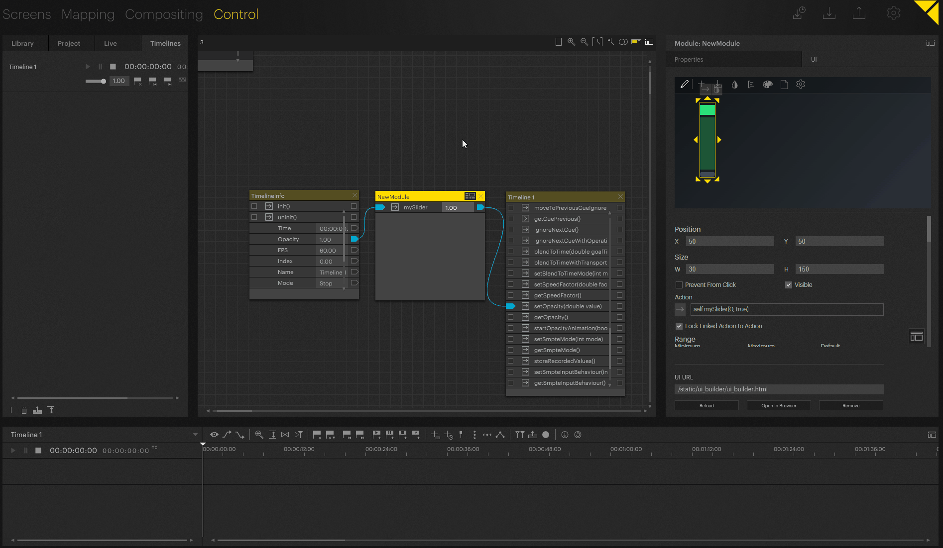
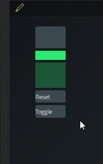
Slider element specific configuration options:
- Position and Size in UI Workspace
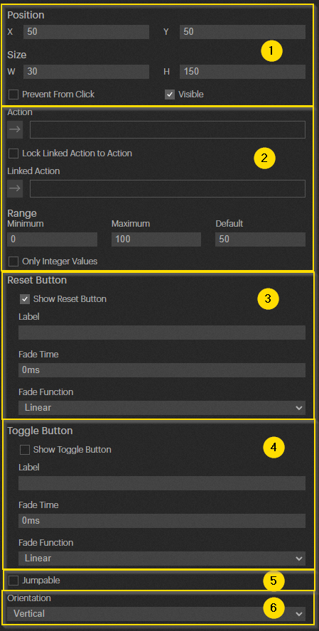
- Configuration of what the fader should act on and in which range it sends values
- Configuration of reset button in UI element, if reset button is pressed then the slider will jump or fade to default value.
- Configuration of toggle button in UI element
- "Jumpable" describes whether a selection in the slider can be used to jump directly to a certain point or whether only the slider can be dragged
- “Orientation” defines the layout of the UI Element
This recording shows the slider with toggle and reset button, without the “Jumpable” checkbox activated
Pixera 1.9.220 | 14. December 2023