 Contact Us


In this article we will go over all the UI elements in Control modules. We will discuss the general settings for all UI elements. Then we will go into each specific element's unique settings and how each can be used.
As an aid you can download this Module with every UI element and relevant actions/linked actions, UIElements
Tip
For this module which contains an aux_directory, you must place the folder inside the zip file into this location of your files. After restarting Pixera the module will then appear in the Control library.
Directory Location: "C:\ProgramData\AV Stumpfl\Pixera\control_library_user"
General UI Settings
There are a variety of settings that are on almost all elements.
Position
Relates the x and y position of the element on the page starting from the top left. This value will also change as the element is moved on the page using the mouse.
Size
Relates the width and height of the element on the page. This value will also change as the element is scaled using the yellow arrows on the element.
Prevent Selection and Visible
The "Prevent Selection" checkbox allows you to make certain elements non-selectable while editing. This is useful for stopping someone from changing elements or to avoid accidentally selecting elements on-top of one another.
The “Visible” checkbox allows the element to be hidden. Useful for hiding elements not helpful for a specific show but used enough to be present on a re-used module.
Action
The “Action” field will allow you to select an action inside any module in the project. This action will be ran if any event is sent from the element. Action acts as a way for the UI to communicate with modules. Example: A button press activating an action to play the timeline.
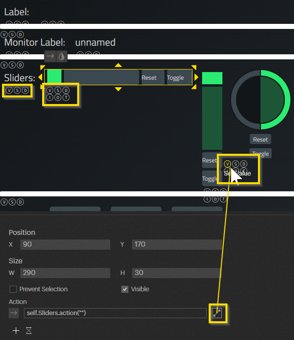
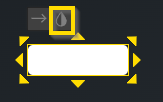
Action UI Connection
To the right of every action is a selectable box. If you click and drag from the box a line will form and UI elements present will gain small circles with letters inside. This functionality allows you connect two UI elements together so they can share values. An example would be using a “Slider” to update a “Label" without needing to use an action in-between.
There are currently 6 types of connections that can be made, three being unique to the “Sliders”.
V: “Set Value”, the connected action will set the value of this element, could be a variety of values.
S: “Set Style”, the connected action will set the style of this element, will be a string the same name as a style.
D: “Set Is Visible”, the connected action will set if the element is visible, will be a boolean value.
I: “Trigger InFade”, the connected action will trigger the “Slider” to fade from the min to the max.
O: “Trigger OutFade”, the connected action will trigger the “Slider” to fade from the max to the min.
T: “Trigger To Value”, the connected action will trigger the “Slider” to fade to the received value.
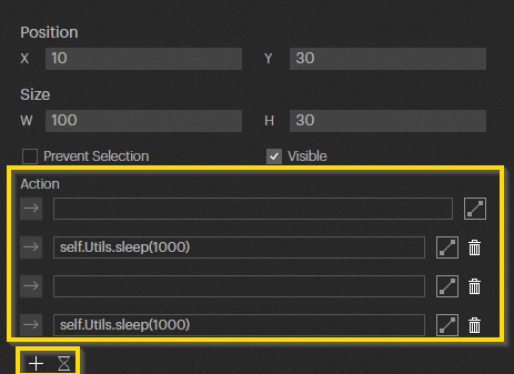
Multiple Actions and Wait
Below the Action are two buttons, a “+” and an hour glass icon. The “+” button will add a new action field allowing you to trigger multiple actions at a time from the element. The hour glass icon allows you to create a sleep timer to add a delay in when the action will be activated.
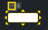
Action Arrow
Every element has a tab that can be clicked to quickly add an action to the element.
Linked Action
The “Linked Action” field will allow you to select an action inside any module in the project. When this action is ran, its called data will be used to change the element. Linked Action acts as a way for the modules to communicate with the UI. Example: Changing the text on a label based on the selected Timeline.
Style
General Color Button
Style Action
The “Style Action” field will allow you to select an action inside any module in the project. When this action is run, its called data will be used to set a style on the element, either one created by yourself or a special style. Example: Two different actions change a Label's style from “Green” to “Blue” by returning that as a string.
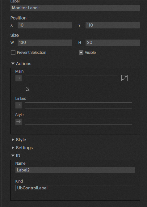
ID
The ID of an is used when creating your own CSS file and aiming to change specific UI elements. This ID can be changed to whatever you like and can then be referenced in the CSS file.
Control Kind
Control Kind specifies what type of UI element is selected. This name can be used in a CSS file to change the style on all UI elements of this type. This is because the name is a class attached to each UI element, so any additions to it in a new CSS file will override Pixera's own.
Order
You can switch the order that the UI element is in compared to all other elements. This allows you to have an element appear in front of or behind another element.
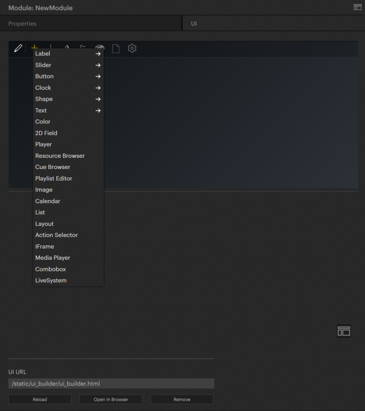
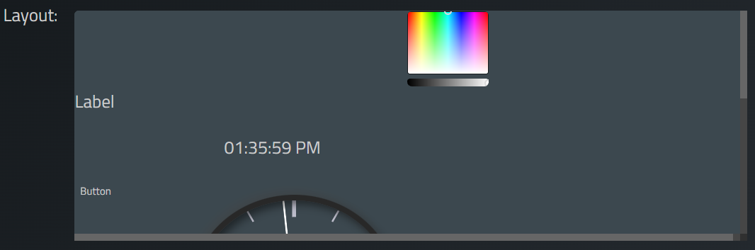
Elements
Labels
There are two types of 'Labels", the normal “Label” and the “Monitor Label” which look the same but have different uses.
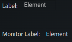
Label
Use
The “Label” is used as a text element to display titles, names, or values. The “Label” and the “Monitor Label” have the same unique settings.
Label
It is simply the text of the label.
Scroll Direction
You can set if the text should remain stationary or if it should scroll in any of four directions. This scroll will repeat indefinitely.
Scroll Direction in Sec.
If using a scroll, you can set the amount of seconds it will take for the scroll to play one loop.
Scroll Delay
If using a scroll, you can set a delay in seconds for when the scroll will begin to play.
Round Value and Round Decimal Places
A checkbox which will allow decimal values received by the label to be rounded. The “Round Decimal Places” field will decide what place the value is rounded to.
Action/Linked Action
Action: Will be activated if the “Label” is clicked on.
Linked Action: Will set the text of the “Label” to be the called data.
Monitor Label
Use
The “Monitor Label” only has a label as a unique setting, meaning their is no scrolling functionality. This element has a special function being that it will constantly run whatever action is set in the “Action” setting. An example of its use would be to monitor the Current Time on a Timeline.
It is important to note that all other elements use the “pixc.callRefs” function to receive data from a Module. The “Monitor Label” on the other hand, uses the “return” keyword to receive data.
Action
Will set the text of the “Monitor Label” every frame.
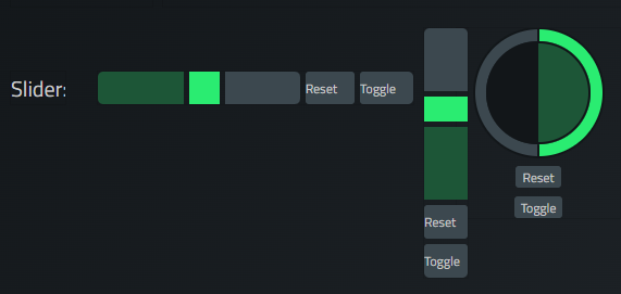
Slider
There are three types of “Sliders”. The “Horizontal”, “Vertical”, and “Circular” sliders all have the same unique settings, each only differ in their design.
Use
The “Slider” is used to smoothly change between a range a values. It has a variety of unique settings including buttons to add additional functionality.
Range
Here you can set the “Minimum” and “Maximum” values the “Slider” will go between. It will then automatically calculate the value to send based on its location. You will also set a “Default” value which is what the element will be set to when first opened or refreshed. You can also set if the “Slider” should use only integer values, as it uses doubles (decimals) by default.
Reset Button
The reset button on the “Slider” allows you to set it back to its default setting. This button can be turned on or off. It also has three settings.
Label
The text on the button.
Fade Time
The “Slider” will fade to the default value over the given time in milliseconds. Useful for creating a more smooth change.
Fade Function
Sets the type of fade calculation to use. Linear will fade directly to the default value at the same rate throughout. Ease In will make the fade slow at the beginning but become fast and linear by the end. Ease Out will make the fade fast and linear at the beginning but will slow by the end. Ease In Out will do both, meaning the beginning and the end will fade slowly.
Toggle Button
The toggle button on the “Slider” allows you to set it to its maximum or minimum value. This button can be turned on or off. It also has three settings.
Label
The text on the button.
Fade Time
The “Slider” will fade to the default value over the given time in milliseconds. Useful for creating a more smooth change.
Fade Function
Sets the type of fade calculation to use. Linear will fade directly to the default value at the same rate throughout. Ease In will make the fade slow at the beginning but become fast and linear by the end. Ease Out will make the fade fast and linear at the beginning but will slow by the end. Ease In Out will do both, meaning the beginning and the end will fade slowly.
Action/Linked Action
Action: Will be activated if the “Slider” is moved.
Linked Action: Will set the current value of the “Slider” to be the called data, can be used to move the handle's position based on a value in Pixera (Ex. Current Timeline Opacity).
Buttons
There are four different types of “Buttons”. The "Button", "Multi Button", "Checkbox", and "Radio Button". Each have various unique settings and uses.
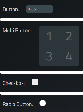
Button
Use
The basic “Button” is used to activate an action on press as well as on release is set. The “Button” also has a toggle mode, making this element have a couple new “Action” settings.
Release Action
The “Release Action” will be called when the mouse click is let go after pressing the button. This setting is useful to “end” the effects of whatever action is set in the “Action” setting.
Can Be Toggled/Toggled Action
The “Can Toggle Action” setting allows the “Button” to become a toggled button, similar to the "Checkbox" talked about later. This setting also reveals a new “Action” setting called “Toggled Action”. This action will be called every time the “Button” is untoggled. To then do a back and forth toggle with actions, you would want to set an action to the “Action” setting and the opposite action to the “Toggled Action” setting.
Special Style Option
All “Buttons” have a true state and a false state. This state can be referenced using the “active” class in a button's Custom CSS. Using this class you can have a button change its style via a “Linked Action” when sending a true or false value to the button. An example would be to have a button which will hide all other buttons once pressed.
Action/Linked Action
Action: Will be activated if the “Button” is pressed
Linked Action: Will set the current toggle state of the “Button” using a true or false value. Will change the toggle state of the element even if “Can Be Toggled” is off.
Multi Button
Use
The “Multi Button” allows you to have multiple buttons on one element which can each have their own text, image, and value.
Columns and Rows
Specifies how many buttons you want in the element and how they should be ordered by row and column.
Labels
The text on each button. Each label added will correspond with the button in that position. So the third label added will place its text on the third button if available.
Values
The value that will be sent by the button when clicked. Each value added will correspond with the button in that position. So the third value added will be used on the third button if available.
Images
The image that will display behind the label on each button. Each image added will correspond with the button in that position. So the third image added will appear on the third button if available.
Action
When a button is pressed, its value will be sent.
Checkbox
Use
“Checkbox” will send a true or false value when checked on and off respectively.
Action/Linked Action
Action: Will send a true value if toggled on and a false value if toggled off.
Linked Action: Will set the current state of the “Checkbox” using a true or false value.
Radio Button
Use
A “Radio Button” will send a value once and then stay on until turned off by another “Radio Button”. This can be done by grouping the buttons together, so that when one button is on any others in the group turn off.
Value
The value that will be sent by the button when clicked. This value is also the reference for what button is set in a "Linked Action".
Group Name
The name of the group this button will be linked to. All buttons with this group name will deactivate when this button is active, and this button will deactivate if any of the other buttons are active.
Action/Linked Action
Action: Will send the value of the button.
Linked Action: Will activate this button if the returned value is the same as this button's value.
Clock
There are two types of “Clocks”. The “Digital” and the “Analog” which each act similar to their real counterparts.
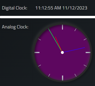
Digital Clock
Use
The “Digital Clock” displays the current time and date in numbers similar to many electronic systems. This time can be modified to display the information in different formats.
Show Time
Allows you to turn off the clock text, in case you only want to see the current date.
Show Date
A checkbox which will reveal the current date.
Time Format 24
A checkbox which will change the time format to 24 hours, or military time. So instead of 1:00pm the clock will read 13:00.
Date Format 9/12/2023
A checkbox which will change the format of the date to be with slashes (/) instead of periods (.).
Action
This element's “Action” field does not have an effect.
Analog Clock
Use
The “Analog Clock” displays the current time using a typical clock visual. The clock's colors can be quickly changed using unique color picker fields.
BG
Allows you to change the colors of the clock.
Color = Background, Can toggle if the background is “Transparent” or not.
Second Color = Second Hand.
Minute Color = Minute Hand.
Hour Color = Hour Hand.
Action
This element's “Action” field does not have an effect.
Shapes
There are two types of “Shapes”. The “Rectangle” and the “Circle" are simple UI visual elements used to create designs.
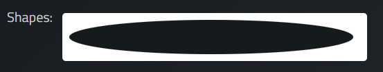
Use
The “Shapes” are used to create designs for the UI, either making a pattern or to overlay or underlay another element.
Action
This element's “Action” field does not have an effect.
Text
There are two types of “Text”. The “Textbox” and the “Textarea" are input boxes with similar methods but some key differences.
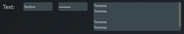
Textbox
Use
The “Textbox” allows you to input a string of characters to be used by an action in the module. Note, the element will send the inputted string to the connection action in the module after every character change. So inputting “Hello” will send five messages starting with “H”. This string can also be password protected. The “Textbox” can also display a string of information from the module, similar to a “Label”.
Is Password
A checkbox which will hide the inputted message with square icons, similar to how a password would be entered.
Execute on Enter
A checkbox which will not send the inputted message with each change of a character, and instead will only send the string when the “Enter” key is pressed.
Action/Linked Action
Action: Will send the string inputted.
Linked Action: Will change the input to the string received.
Textarea
Use
A “Textarea" allows you to input a string of characters to be used by an action in the module. Note, the element will send the inputted string to the connected action in the module after every character change. So inputting “Hello” will send five messages starting with “H”. The “Textarea” can also display a string of information from the module, similar to a “Label”.
Unlike the “Textbox”, the “Textarea” can hold multiple rows inside the inputted string. This can allow paragraphs to be entered and the size of the element to be increased in both the x and y dimensions as text can be seen everywhere. In contrast, the “Textbox” can only have text in one line, making only the x dimension effect when scaling.
Action/Linked Action
Action: Will send the string inputted.
Linked Action: Will change the input to the string received.
Display
The “Display” elements allow you to visualize data using bars. The two types of “Displays” are the “Level Meter”, vertical, and the “Progressbar”, horizontal.
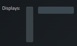
Use
The “Display” elements function the same, only difference being their orientation and visual design.
Range
Allows you to set the “Minimum” and “Maximum” values the "Display" will go between.
Linked Action
Will fill in the element based on the value received.
Table
The “Table” element allows you to enter or retrieve Lua table data.
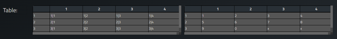
Use
The "Table” element can be used to send a string of data to a module which can then be processed and used. The element can also receive data from a Lua table and display it.
Table Size
Allows you to set the size of the table, note to see the whole table will need to resize the element itself.
Read Only
A checkbox which will make the table un-clickable and so un-editable.
Visible Properties
This section allows you to set what aspects of the “Table” are revealed. These include:
Column Header: Will reveal the column header
Row Header: Will reveal the row header.
Action/Linked Action
Action: Will send a formatted string with the data from the table on enter.
Linked Action: Will fill in the table when receiving a Lua table.
Color
The “Color” element involves setting a color to be sent to an action, this color takes the form of the r, g, and b values of the set color.
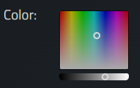
Use
The “Color" element allows you to move a pointer horizontally to change the “Hue” (Actual Color), vertically to change the “Chroma” (Strength of the Color), and a separate pointer for the “Value” (Brightness) of the color.
Range
Allows you to set the “Minimum” and “Maximum” values the "Color" will go between. The element will then automatically calculate the value to send based on the pointers' locations. You can also set if the “Color" should use only integer values, as it uses doubles (decimals) by default.
Action/Linked Action
Action: Will send the three values, the “R” value of the color, the “G” value of the color, and the “B” value of the color.
Linked Action: This element's “Linked Action” field does not have an effect.
2D Field
The “2D Field” involves setting a pair of “X” and “Y” values based on the location of the element's moveable pointer.
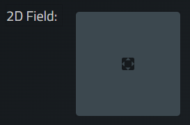
Use
The “2D Field" allows you to move the pointer around the square. The horizontal position decides the “X” value and the vertical position decides the “Y” value. Calculations start from the the top left at the “Minimum” value set and end at the bottom left at the “Maximum” value set.
Range X
Allows you to set the “Minimum” and “Maximum” “X” values the "2D Field" will go between. The element will then automatically calculate the value to send based on the pointers' locations. You can also set if the “2D Field" should use only integer values, as it uses doubles (decimals) by default.
Range Y
Allows you to set the “Minimum” and “Maximum” “Y” values the "2D Field" will go between. The element will then automatically calculate the value to send based on the pointers' locations. You can also set if the “2D Field" should use only integer values, as it uses doubles (decimals) by default.
Action
Will send the “X” and “Y” values.
Player
The “Player” involves setting a timeline for the element to look at and update its information as well as allow you to control the timeline.
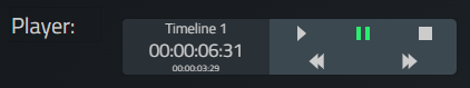
Use
The “Player" allows you to set a timeline to be loaded into the element. The element will then update to reveal values of the timeline such as its name, current time, and current countdown.
Visible Properties
This section allows you to set what aspects of the “Player” are revealed. These include:
Show Buttons: Will reveal the buttons section.
Show Play Button: Will reveal the “Play” button.
Show Pause Button: Will reveal the “Pause” button.
Show Stop Button: Will reveal the “Stop” button.
Show Next Button: Will reveal the “Next” button.
Show Prev Button: Will reveal the “Previous” button.
Show Timeline Name: Will reveal the timeline's name.
Show Timeline Time: Will reveal the timeline's current time.
Show Timeline Countdown: Will reveal the timeline's current countdown.
Action/Linked Action
Action: A special “Action” type with the “C Circle" logo. This means the “Action” field will only allow you to set a specific object. The “Player” will only allow a timeline to be set, any other action or object selected will keep the field blank. Timelines can be found in the “Pixera.Timelines.getTimelines()” section.
Linked Action: Can receive the name of a timeline, in the form of a string. Doing so will automatically update the element to look at that timeline, allowing you to quickly change what timeline is being viewed
Resource Browser
The “Resource Browser" controls a set layer to play media within a specified folder onto that layer.
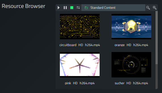
Use
The “Resource Browser" will display all of the media inside a specified folder. This can be done either by selecting the folder with a dropdown or by giving by a path in the inspector. You can then set a layer for the element to control. Selecting a piece of media will apply that media onto the layer. From there the element gives you buttons to “Play”, “Pause”, “Stop”, and “Loop”.
Show Layer Controls
A checkbox which will set if the element will revel the layer controlling buttons “Show Layer Controls”.
Show Folder
A checkbox which will set if the element will reveal the folder selection dropdown.
Media Folder Path
Allows you to set the initial folder which will be loaded into the module using a path to the folder.
Action
A special “Action” type with the “C Circle" logo. This means the “Action” field will only allow you to set a specific object. The “Resource Browser” will only allow a layer to be set, any other action or object selected will keep the field blank. Layers can be found in the “Pixera.Timelines.getTimelines().[Timeline Name].getLayers()” section.
Cue Browser
The “Cue Browser" reveals cues on a set timeline and allows you to apply these cues. The visual also reveals which cue was used last by highlighting that cue in yellow-green.
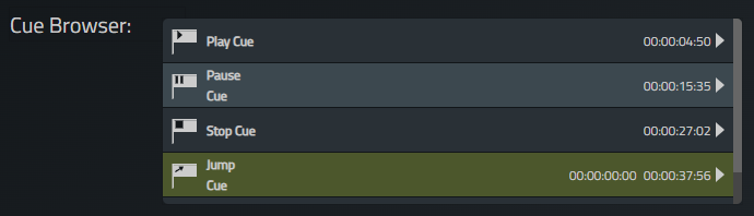
Use
The “Cue Browser" will display all the cues which have a label on a set timeline. The element will also reveal if the cue is a “Play”, “Pause”, “Stop”, or “Jump” cue as well as the cue's position in time. For “Jump” cues, there is also a visual of the time the timeline will jump to. Lastly, the element has a play button allowing you to apply that cue.
Right Click
The “Cue Browser” allows you to right click on the element's cues to rename the selected cue or add a note to the selected cue.
Always Scroll Down
A checkbox which will make the cues scroll as they are applied in the timeline. If this checkbox is off, then the “Cue Browser” visual will not automatically move as cues are applied and so the green highlight on the last played cue will disappear beyond view.
Disable Right Click
A checkbox which will stop the “Cue Browser” from being able to use its right click functionality
Visible Properties
This section allows you to set what aspects of the “Cue Browser” are revealed. These include:
Show Play Cues: Will reveal all “Play” cues.
Show Pause Cues: Will reveal all “Pause” cues.
Show Jump Cues: Will reveal all “Jump” cues.
Show Stop Cues: Will reveal all “Stop” cues.
Show Unnamed Cues: Will reveal all “Unnamed” cues.
Double Click Fade To Cue: Will fade to a cue that is double clicked.
Show Play Button: Will reveal the “Play” button to apply cues.
Fade Time In Seconds
Allows you to set the amount of time a cue will take to fade in if “Double Click Fade To Cue” is on and you double click a cue.
Action/Linked Action
Action: A special “Action” type with the “C Circle" logo. This means the “Action” field will only allow you to set a specific object. The “Cue Browser” will only allow a timeline to be set, any other action or object selected will keep the field blank. Timelines can be found in the “Pixera.Timelines.getTimelines()” section.
Linked Action: Can receive the name of a timeline, in the form of a string. Doing so will automatically update the element to look at that timeline, allowing you to quickly change what timeline is being viewed
Playlist Editor
The “Playlist Editor" will apply media added from the “Resource Browser” to a set layer. This media can be modified to loop or have fade in-between each other.
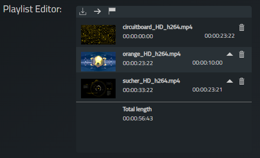
Use
The “Playlist Editor" Uses three buttons. A “Save” storage icon allows you to save the media inside the element, to which the media will reappear after a refresh of the UI. An “Apply” arrow icon allows you to send the media to the set layer. An “Apply With Jump” flag icon will do the same as the arrow icon except it will delete all cues on that timeline and add a jump cue at the end of all media going back to the beginning of the timeline.
Media can be added to the element from the “Resource Browser” element. The media will be added one after another, starting at the exact end time of the last media added. Each media on the element will display its name, duration, play time, an arrow icon to move the media up in the list, and a trash icon to delete the media from the list.
Lastly the element displays the total length of the media playlist created.
FadeTime
Allows you to enter the length of time a fade will occur between the media if the “Fade Between Clips” checkbox is on.
Visible Properties
This section allows you to set what aspects of the “Playlist Editor” are revealed. These include:
Apply: Will reveal an arrow in the top right corner to apply the media to the set layer.
Apply With Jump: Will reveal a flag in the top right corner to apply the media to the set layer with a jump cue at the end.
Action/Linked Action
Action: A special “Action” type with the “C Circle" logo. This means the “Action” field will only allow you to set a specific object. The “Playlist Editor” will only allow a layer to be set, any other action or object selected will keep the field blank. Layers can be found in the “Pixera.Timelines.getTimelines().[Timeline Name].getLayers()” section.
Linked Action: Can receive the name of a layer, in the form of a string. Doing so will automatically update the element to look at that layer, allowing you to quickly change what layer is being changed.
Image
The “Image" element will display a set png/jpg image file.
Use
The “Image" element can point to an image inside the Aux Directory of the module, the same location where images can be used in CSS for the browser's design. To use the element you must make the module “Store in Own Aux Directory” and then place your images in the directory's “html_root” folder.
Image
Allows you to set the image for the element to show.
Size
A drop box which will allow you to set how the image will be displayed inside the image element.
Original: Will display the image in its native resolution, ignoring the resizing of the element. The image can be cut off depending on the scale.
Cover: Will display the image taking over the entire element, determined by the element's width and height. The image can be cut off depending on the scale.
Contain: Will display the image taking over the entire element, determined by the element's width and height. The image will be resized and never cut off.
Stretch: Will display the image taking over the entire element, determined by the element's width and height. The image will be stretched and deformed.
Action
Will activate the action when the image is clicked on.
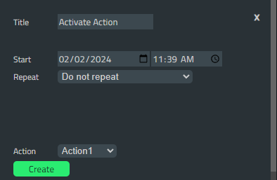
Calendar
The “Calendar" element allows you to schedule specific times for an action to be ran.
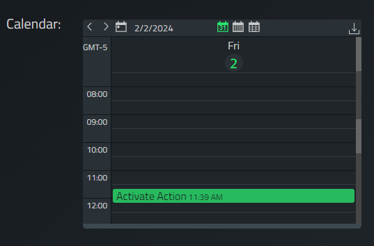
Use
The “Calendar" element will display any day/week/month selected. You can then click on a time to create an event which will run at the specified time. The event will be linked to an action which will be ran at that time. These events can also be made to repeat.
Enabled Views
This section allows you to set what aspects of the “Calendar” are revealed. These include:
Day: Will reveal the day view icon.
Week: Will reveal the week view icon.
Month: Will reveal the month view icon.
Auto Store: Will auto store the created events. If not selected you must store in the top right corner of the element or else events will be deleted on reload.
Event Actions
Allows you to create actions which can be set for created events. These actions can also be given names to help organize options.
Save Schedule
Allows you to store the current schedule from the inspector instead of needing to use the icon in the element's top right corner.
Action
Will activate the action when the event is triggered at its specified time.
List
The “List” element displays a group of text in a given order with an optional color attached.
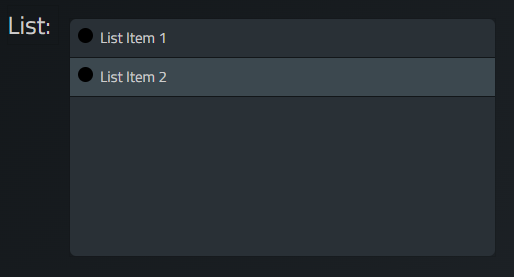
Use
The “List" element allows you to have a visual list of data to use for various purposes. Each item on the list can be clicked separately to send its name to the connected action allowing a “Button”-esq workflow. The list can be updated automatically or manually and each item can be given a color on its indicator to help organize.
Show Indicator
Allows you to see a circle indicator for the list item. This indicator can be given a color to mean whatever desired. An example would be making the indicator red for a destructive action and making it green for a constructive one.
Default Values
Allows you to set items of the “List” manually. You can create as many items as desired or delete ones already present. You can also change the color of the indicator here.
Action/Linked Action
Action: Will send name of the clicked item.
Linked Action: Can receive a table, will update the “List” to hold any string variable inside the table with indicators being set to the color black. You can also input a boolean to create a “?” entry with either a green indicator for true or a red indicator for false. If you would like to set the indicator color, you will need to send a table with each element being its own table. Inside you will set the “value” of the item and the “color” of the indicator in Hex code. Here is an example:
local table = {{value = "List Item 1", color = "#ff0000"}, {value = "List Item 2", color = "#00ff00"}}
Layout
The “Layout” element displays a created page in the UI inside of another page.
Use
The “Layout" element allows you to display a page created in the UI on another page with unique formatting options.
Value
Allows you to set the text of the first label this element registers to the entered characters.
Layout
Allows you to set how the elements from the page are sorted inside the "Layout".
Stack (vertical): Will stack the elements from top to bottom based on their vertical position on the page.
Stack (horizontal): Will stack the elements from left to right based on their horizontal position on the page.
Flow: Will stack the elements based on their overall position on the page.
Scale
Allows you to set how the element will scale its size to the current page. If the element is scaled while one of the selections is on, the element will go back to behaving as if it was set to “none”, however the selection in the dropdown will not change.
none: Will not scale the element, you have full control of the element's scale.
Fit Vertical: Will stretch the element to take up the current horizontal width of the screen.
Stack (horizontal): Will stack the elements from left to right based on their horizontal position on the page.
Flow: Will stack the elements based on their overall position on the page.
Page
Allows you to set the page this element will look to for generating its image and data.
Action/Linked Action
Action: This element's “Action” field does not have an effect.
Linked Action: This element's “Linked Action” field does not have an effect.
Action Selector
Under Development.
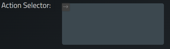
Use
NA
Result Kind
NA
Action
NA
IFrame
The “IFrame” element displays a webpage via a given URL.
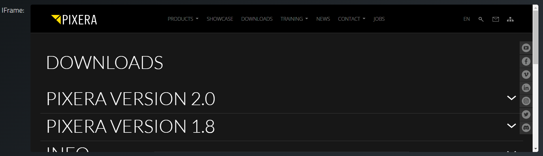
Use
The “IFrame" element allows you to open any webpage in a resizable window. The webpage inside can eb interacted with just like a normal webpage. Note that clicking a link to a new webpage will change the entire UI to that webpage, not the element's view. Resizing the element will show more of the set webpage.
URL
Allows you to set the URL of the webpage you want to display in the element.
Action/Linked Action
Action: This element's “Action” field does not have an effect.
Linked Action: Can receive a string, will update the webpage the element displays with the given string if in the form of a valid URL.
Media Player
The “MeidaPlayer” element plays a set video.
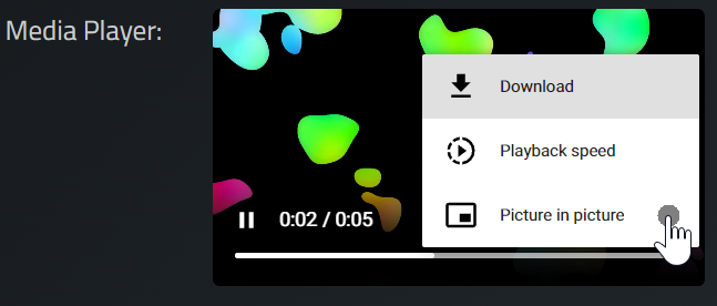
Use
The “MediaPlayer" element can point to an video inside the Aux Directory of the module, the same location where videos can be used in CSS for the browser's design. To use the element you must make the module “Store in Own Aux Directory” and then place your videos in the directory's “html_root” folder.
Image
Allows you to set the video for the element to play.
Settings
A variety of checkboxes to customize the element:
Autoplay: Will automatically play the video when the UI is loaded.
Muted On Start: Will automatically mute the video when the UI is loaded.
Media Controls: Will display additional controls on the UI element to allow a variety of actions, such as playing, downloading, full screening, etc.
Loop: Will decide if the element will replay the video continuously once it reaches its end, creating a loop.
Action
This element's “Action” field does not have an effect.
Combobox
The “Combobox” element creates a dropdown with a list of entries
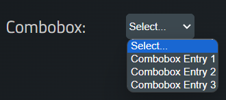
Use
The “Combobox" element allows you to create a dropdown of options for the user to choose between. The entrys can be updated automatically or manually.
Default Text
Allows you to set the text which will be shown as the default value.
Entrys
Allows you to set the entrys which will be available in the dropdown. When entering manually each entry must be placed into its own line.
Action/Linked Action
Action: Will send name of the set entry.
Linked Action: Can receive a string, will update the “Combobox” with a list of entry's if given as a table with a element named “entrys” in it. It can be in a json format but does not have to be. "pixc.callRefs()" is then used to send the table to the ModuleUI element.
Here is an example without using the json format. In this example, the content folders are read in Pixera, and this content is made available as a selection in the dropdown:
-- get the resources in the pixera folder
local res_folder = Pixera.Resources.ResourceFolder.getInst('Media/Standard Content').getResources()

-- create a empty table
local named_list = {}

-- fill the table with content names and id's
for i,n in pairs(res_folder) do
	named_list[i] = n.getName()
end

-- create empty table
local dropdown_elements = {}

-- add element "entrys" to this table and assign the table holding the content names and id's to it
-- the value of the element will be shown in the list, therefore we filled the value with the name of the resource
dropdown_elements.entrys = named_list

-- callRefs is needed to communicate with the linked action in ModuleUI, return does not need to return dropdown_elements, it is not needed in this case
pixc.callRefs(dropdown_elements)
return
Here is an example using the json format:
table = {"Combobox Entry 1", "Combobox Entry 2", "Combobox Entry 3"}
if self.json == nil then
    self.json = require "json"
end
local res = {}
res["entrys"] = table
pixc.callRefs(self.json.encode(res))
LiveSystem
The “LiveSystem” element displays status and output information about a connected livesystem in Pixera.
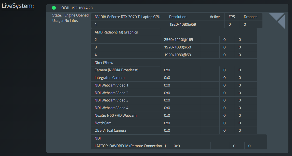
Use
The “LiveSystem" element allows you to see the current status and information on any livesystem which will update the element in real time as it changes. Aspects you can look into include: Engine state, Usage, Outputs with their resolution, state, FPS, and dropped frames, and inputs with the same information. An indicator in the top left also will show the name of the livesystem, its IP address, and a green or red circle for if the livesystem is open and active (green) or closed (red).
Visible Properties
This section allows you to set what aspects of the “LiveSystem” are revealed. These include:
Show Logo: Will reveal the Pixera logo.
Show Outputs: Will reveal all outputs.
Show Inputs: Will reveal all inputs.
Show Outputs Active: Will reveal a column showing if an output is active or inactive.
Show Resolution: Will reveal a column showing the resolution of each output and input.
Show Current FPS: Will reveal a column showing the FPS of each output and input.
Show Dropped Frames: Will reveal a column showing the dropped frames of each output and input.
Action
A special “Action” type with the “C Circle" logo. This means the “Action” field will only allow you to set a specific object. The “LiveSystem” will only allow a livesystem to be set, any other action or object selected will keep the field blank. Livesystems can be found in the “Pixera.LiveSystems.getLiveSystems” section.
Pixera 1.9.274 | 15. February 2024